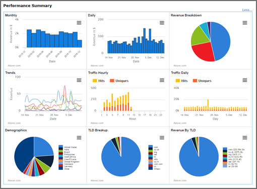
 Make fast ROI-improving decisions based on portfolio-level data provided in nine different AutoPilot charts.
Each chart is interactive. The specific data associated with a pie slice, bar, or trend line will appear whenever you hover over it.
The Portfolio Demographics chart shown here is just one example of how you can get a quick, helpful portfolio overview. When you hover over a desired slice in your AutoPilot dashboard, you will see the exact % unique visitors from a given country.
There are eight more portfolio-level charts designed to help you make fast, informed decisions, including the following:
- Monthly Revenue (bar chart last 12 months)
- Daily Revenue (bar chart last 30 days)
- Revenue Breakdown by Monetization Channel (pie chart last 7 days)
Login now and check out all of the portfolio-level charts available in your AutoPilot dashboard. And don’t forget that you can easily generate similar reports at the domain level using AutoPilot’s advanced custom report tool.