 Have you ever wanted to see a quick snapshot of how revenues are broken down over time between your different monetization channels?
If so, AutoPilot has just what you need.
After logging in to your AutoPilot dashboard, simply click the “More” link next to the third chart. This will expand the page to display a total of nine charts.
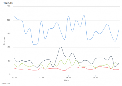
The Revenue Trend chart is the fourth option on the page. The lines in the chart show the ups and downs of daily revenue over the last 30 days from each one of your monetization channels. Hover over any line/day to see revenues earned. Thanks to the instant side-by-side comparison of revenue trends by channel, it is one of the most popular charts in AutoPilot’s dashboard.
Why is this chart important?
- Allows domain investors to quickly see an unusual shift up or down within a monetization channel so that it can be investigated and acted upon.
- Helps domain investors to easily spot positive or negative trends over time and take applicable actions if needed.
The Revenue Trend chart is just one of nine instantly viewable charts available to our clients through their AutoPilot dashboard. Each chart offers a different angle from which to view the health and performance of your portfolio.
Here is a list of all nine interactive charts:
- Monthly revenue
- Daily revenue
- Revenue by service
- Revenue trends by service
- Hourly traffic
- Daily traffic
- Demographics
- TLD Breakdown
- Revenue by TLD
Need detailed data beyond what the charts provide? No problem. Visit the Reports section within your AutoPilot account. You can select from a wide range of variables to include in a custom report.
Need help? Our support team is happy to provide assistance.